A recurrent theme of classical lines and exaggerated width has proliferated across BMW’s lineup and into the sixth generation 3 series sedan. Last seen applied to the new F20 1 series, several design highlights mark the new 3er as a fresh new product with classic appeal. Let’s take a closer look at the subtleties of BMW’s new 3 series’ design.
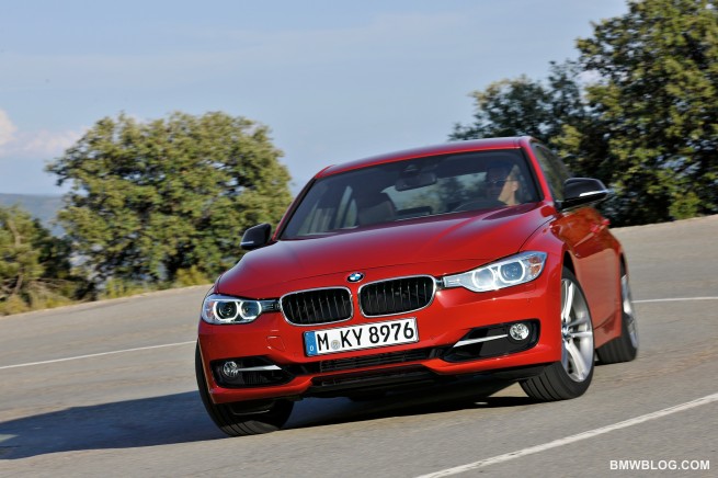
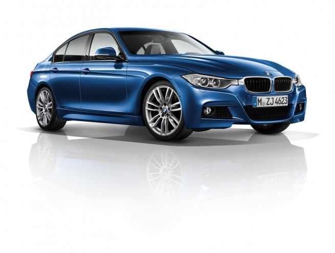
First and foremost: the dimension of width has been emphasized in every aspect of the exterior design. Of course, the width of the car has in fact been increased – approximately two inches front and rear. Starting at the front of the vehicle, the fascia spreads itself from corner to corner, now continuous without interruption from lateral elements. The wide and narrow opening, fitted with black plastic aero elements throughout, keeps your eyes panning from side to side.
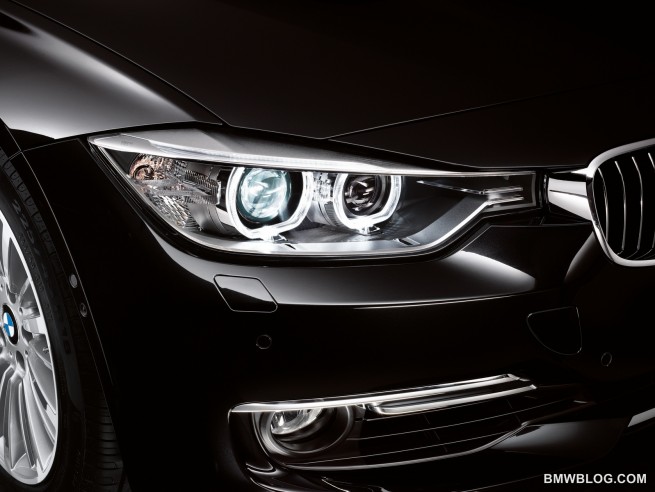
The new headlight design, now connected laterally to the side of the kidney grills, also creates the impression of increased width. First seen applied on the new 1 series, this styling approach is well executed in the new 3 series, and while it looks decent in photos, we expect it, like most new BMW’s, to look far better in the flesh. Speaking of the kidney grilles, they are also found to be wider and lower than those featured on the previous generation E90 sedan.
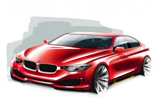
“Bow waves” as BMWBLOG has coined them, spread from the roundel outwards to the bases of the A-pillars. These elevated lines stamped into the bonnet are now spread further apart, also increasing the illusion of… you guessed it: width. The F30 3 series features a double bow wave design – four separate prominences – which allows light to play off of the bonnet in a more dynamic, interesting way.
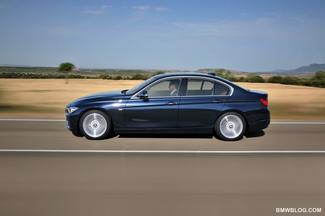
Sharply pressed body paneling is not limited to the hood – but found circumventing the entire car. The now familiar side sculpturing once again features concave and convex aspects running the length of the car. The most pronounced crease runs very high on the belt-line, transecting both door handles on the way to the rear tail light fixture. A more subtle character line runs low above the rocker panel, feathering into existence off of a diagonally dropping crease which initiates off the top of the front wheel well. We first saw this diagonal character line dropping from the front wheel arch on the new 6 series, and while its application on the new 3 series has been somewhat more restrained, it still creates the same illusion of movement in the sheet metal.
We like it.
From the A-pillars, a coupe-like roof line slants back toward the rear of the vehicle. The new 3er features a proportionately long hood, a tribute to the longitudinally mounted inline engines traditionally found under the hood of BMW sport sedans. The elevated “power dome” running up the length of the hood is a classic design hallmark of BMW cars, also reminding onlookers of the inline engine found beneath – whether four or six cylinders are firing in line.
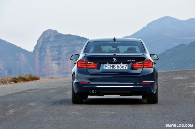
Moving to the rear of the vehicle, width is once again the word of the day. The lower rear fascia features a very tight and narrow horizontal line. The rear tail light fixtures are narrower and wider, and the flared rear wheel fenders lend a final tribute to the increased width.
BMW is offering an M sport package on the new 3 series, as expected. A very slightly lowered ride height, stiffer suspension, and more aggressive aero kit spices up the look a bit. We like the classic look of the the 3er, but we must give a nod to the gaping air intakes found on the M sport pack.
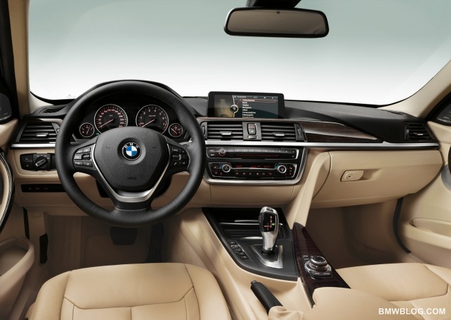
Finally, the interior design is gorgeous, with layered surfaces of different textures and colors flowing across the dash. The new infotainment system yet again features a fixed, high-res screen jutting up from the center of the dash. Okay, it’s been said to look like, “an iPad taped on the dash” – a humorous if inaccurate description – but when comparing the screen layout from the E90 to the new F30, it’s clear to see how the new design offers a lighter, more sculptured look.
Once again, we expect this new BMW to have a much stronger visual appeal in the flesh. This is typical of new BMW cars, as they become more and more sculptured. Imagine appreciating sculptures under the bright lights of an art gallery, instead of viewing photos of the same sculptures on your computer screen. If the 3er manages to impress in person as much as the new 1 series managed to surprise us after seeing it in person – the F30 will be a stunning car for your eyes to enjoy. We’ll wait to pass final judgment until seeing it in the flesh.
Most importantly – we can’t wait to get behind the wheel, and bring you our first driving impressions of BMW’s latest driving machine.


Author: Shawn Molnar
Source: http://www.bmwblog.com/2011/10/16/bmwbl ... dern-tech/

